
Wealth Patterns Across America
The United States economy is one of the largest in the world, but even within the country each state has its own buzzing economy. Some, like California’s, are large enough to beat out most other countries on their own, while others are considerably smaller. As a result, the wealth patterns in each state can be vastly different.

This map was created using Tableau using the state and two or more estimate columns in our median household income dataset. The two or more estimate columns were then averaged over time to get the values in the map.
This visual showcases geographical relations between the states based on income. Specifically, it compares how states in the middle of the country generally have a lower average household income while the states towards the west have a higher income threshold. These relationships are further explained using the legend, as it showcases that orange states have a low average income while the blue states have a high average income. This visualization provides insights into how location can significantly impact income inequality within the same ethnicity. It proves that there are state-specific income inequalities, stemming from differing economic conditions.

This chart is formatted using a bar graph and graphed by extracting the values from Alabama and California from 2005-2009 using Google Sheets. The standard error values were removed as they are not relevant in this question, and we calculated the difference between the two states (California minus Alabama) to show the income differences within each of the 12 race categories. The bar graph for this question was used because it can highlight the range of the income amount differences and also allow for a potential “negative value” (meaning that there is more of an income difference in Alabama than California for the race). Each block or bar and its height shows the amount of difference in income each race receives from California vs. Alabama.
The choice to compare Alabama and California was a result of two specific reasons. The first is that Alabama was chosen for its Southern political context, while California represents a Westernized state. The second is that California is the state with the highest cost of living, while Alabama is a state with one of the lowest. The analysis reveals significant income disparities favoring California, particularly for Native Hawaiian and Other Pacific Islanders, with the smallest differences seen in Some Other Race and Hispanic or Latino groups. This suggests factors like cost of living and census variations influence these disparities. The economic downturn likely exacerbated these existing disparities, particularly affecting lower-income and marginalized racial groups in both states. The recession’s impact may have intensified income inequalities due to differing state economies, cost of living, and employment opportunities, leading to more pronounced income gaps.
It is important to understand as wealth translates differently in each state, and the impact of a significant economic event such as the Great Recession must be interpreted through both a federal and state level.
Trends in Income by Ethnicity
America is famously referred to as a “melting pot” for its various ethnic groups and racial diversity. Within each people group, there exists different cultures, narratives, and experiences. This phenomenon is known as intersectionality. As a result, an ethnic group’s relationship with wealth and money are vastly different and depend on a variety of factors.

This chart has elements of a heat map and a text table where, instead of numbers, the cells are color-coded based on how high their value is compared to other values in the same column. These numerical values represent the average of the median household income in every state. The lighter the color, the less the average household income from all the states while the darker colors represent a greater average of household income. It allows for an easy comparison of the median household incomes at a glance, and for more details, the legends are added to specify what value each color represents. Overall, it shows us there is a large discrepancy between the range of household incomes between ethnic groups. For example, the average household income in all states for the Black population is $37,806 while the Asian population has an average household income of $66,672, which is nearly double the Black population.
The narrative around income gaps by ethnicity can be explained through three interconnected factors: intergenerational mobility, financial literacy and education, and systemic policies. Chetty, Hendren, Jones, and Porter (2019) emphasize the role of intergenerational mobility, largely influenced by childhood environment, in driving racial disparities in America. Visualization 1 can be understood through the context of intergenerational mobility; some ethnic groups display relative wealth increases, barring economic conditions, while others display decreases. The second major factor that contributes to ethnic wealth gap is financial literacy and education. Kim and Xiao (2021) define financial literacy as the “ability to manage money and take control of their finances”, and highlight this as a major contributing factor in ethnic wealth disparities. The final, and perhaps most significant, factor in defining ethnic wealth disparities in the United States are systemic policies throughout history. African Americans, in particular, have experienced multiple systemic policies whose effects have trickled down throughout history. Historic policies such as redlining and school segregation as well as present issues such as mortgage discrimination additionally affect ethnic wealth disparities (Hanks, Solomon, and Weller 2018).
Effect of Great Recession
The Great Recession marked a turning point and downturn in America’s economic history, with widespread job losses, decline in home values, and overall financial instability. As a result of this financial crisis and instability, American households faced profound changes and decline in their average income.
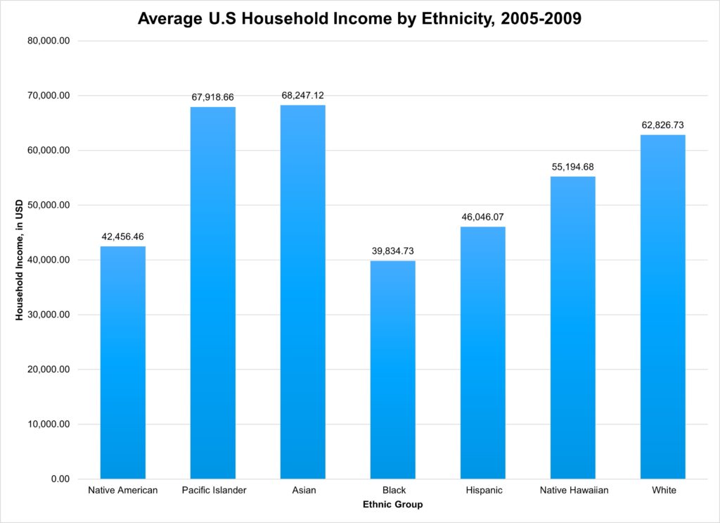
The graph above showcases the average U.S. household income using our data set but specifically used data from 2005 – 2009. These years provide a snapshot of what different household incomes looked like before the Great Recession. Since the Great Recession began in the latter half of 2008, the graph ends in the year 2009 as the economic impact took time to take effect. The column chart highlights how large or how small the average income of each race is by providing an easy visual representation of the disparities in income levels. The different columns represent a different racial group, and the height corresponds to the average income for each group. This visual comparison underscores pre-existing economic inequalities among racial groups, revealing that the Great Recession further exacerbated these disparities.
Prior to the Great Recession, factors such as labor market dynamics, systematic discrimination, and educational disparities primarily contributed to inequalities in wealth distribution. According to the graph, Asian and Pacific Islander groups had a much higher average household income compared to their counterparts. White households also had a higher than average household income, but slightly less than Asian and Pacific Islander communities. This might be the result of historical privilege and wealth accumulation as White and Asian households might benefit from generational wealth accumulation due to historical privileges and less discriminatory practices in housing, education, and employment. Being able to attend better-funded schools, higher education, and more favorable housing prior to the Great Recession led to a high distribution of wealth among White and Asian communities. Black households had the lowest average household income prior to the Recession, which overall illustrates significant economic disparities across different groups. The relatively higher income levels of Asian and Pacific Islander households and the relatively lower income levels of Black households make it clear that there already were notable income inequalities in average income. The chart illustrates how systemic inequalities were intensified by the economic downturn in comparison to the next graph, highlighting the vulnerability of already disadvantaged groups and the persistence of income inequality across racial lines. Minority families generally had lower levels of asset ownership such as income, home equity, and retirement saving which is primarily the result of pre-existing economic conditions. The income disparity was furthered after the Great Recession as job losses and foreclosures disproportionately affected the housing market and household incomes.

The above graph showcases the average U.S. household income using our data set but specifically used data from 2009 – 2013, the era after the Great Recession. The column chart graphed using Google Sheets highlights a before and after effect on income as a result of the Great Recession. The visual representation of income disparities among different racial groups is symbolized with the height of each column corresponding to the average income for each group. All racial groups experienced a decline in average household income after the Great Recession, but the impact varied significantly between each group. Native American household income fell by $2,432.26, Pacific Islander by $1,355.58, Asian by $1,521.94, Black by $1,510.72, Hispanic by $2,463.29, Native Hawaiian by $1,603.94, and White by $2,240.90. This data underscores the uneven impact of the recession, with Native American and Hispanic households experiencing the largest drops in median household income, indicating they were the most negatively affected. The differential contrast in household income within different racial households highlights the recession’s role in exacerbating existing economic disparities among different racial groups.
Overall, American households have not recovered from the effects of the Great Recession. Recovery from the recession manifested in a multitude of ways, one of them being unequal financial recovery. The government’s injection of stimuli into the economy went to banks and financial institutions first, which increased the amount of money circulation in that sector despite the escalated unemployment and job loss rate. Therefore, the median household income, especially in households who suffered from the unemployment crisis during the Recession, had yet to recover to what it once was prior to the economic downturn (Oxford University Press). So while the majority of American households faced a decreased income, the racial wealth gap only increased after the recession as the drop in income as White households recovered faster. This is exhibited by the insignificant drop in median income in these households as shown in the data visualizations before and after 2009. Why this is the case is because of the concept of savings as well as investments in assets and liabilities (Pew Research Center). Post-Great Recession, white households were able to replenish their savings at a much faster rate than non-white households, with the addition of their stock holdings. It was more likely for white households to have the knowledge of savings and own stocks directly than their other counterparts, which played a key role in their recovery. Ultimately, the lack of resources and knowledge faced by racial minority groups after the Great Recession left these households with lower median wealth than prior to the Recession, which leads to the widening of the income gap and inequitable distribution of wealth.